
Responsive design
Responsive design is a method of using media queries in Cascading Style Sheets (CSS) to ensure a site is usable on various devices with different screen sizes, from very small to very large.
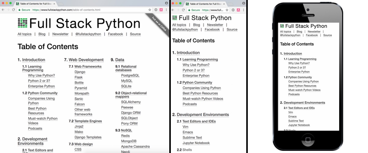
Full Stack Python uses responsive design to improve readability across a broad range of devices that people use to read this site.
Responsive design resources
-
The Responsive Design podcast and accompanying email newsletter interview web designers who've dealt with creating responsive designs from both a blank slate and retrofitting into an existing site.
-
This site is entirely on responsive design and has many articles on how to achieve readability across devices.
-
Using Media Queries For Responsive Design In 2018 contains a bunch of great examples for how to use media queries to achieve a responsive design.
-
Smashing Magazine's article from 2011 on responsive design - what it is and how to use it remains a definitive source for understanding why sites should be responsive.
-
Fundamentals of responsive images shows the code behind several ways to make your web images resize according to browser window size.
您接下来要学习什么主题?
Sponsored By

Fix errors in your Python code before your users see them by monitoring with Rollbar.
Learn More Python

Deploy web apps with the Ansible configuration management tool.

Build microservices with Docker, Flask & React in this great course.
Full Stack Python
Updates via newsletter, Twitter & Facebook.